Mobile-First Web Design for Tradespeople
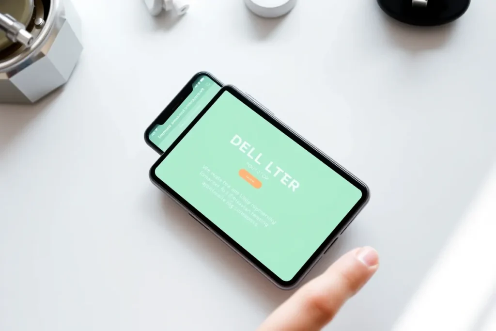
Mobile-first design means building for the phone first and scaling up, because most local “near me” searches happen on mobile and that is where the call is won or lost.
- Speed on mobile keeps the visitor on the page.
- Tap-friendly click-to-call is the most important element for trades.
- A sticky call bar keeps contact one tap away.
Mobile-first design means designing for the phone first, then scaling up to desktop, rather than the other way round. It matters because most local searches for a tradesperson happen on a mobile, often urgently, and Google indexes the mobile version of a site. A site that works on a laptop but is slow or fiddly on a phone loses the majority of its leads. This guide covers why mobile-first wins and what it includes. We build mobile-first sites as part of our web design service.
Why Mobile-First Matters for Trades
Search behaviour decides it. A homeowner with a leak searches on the nearest device, which is a phone, and wants to call someone fast. Google uses mobile-first indexing, judging the mobile version of the site for ranking. And on-the-go customers will not pinch, zoom, or hunt for a number; if the mobile experience is poor, they tap the next result. Mobile-first is not a nicety for trades; it is where the demand is.
What Mobile-First Design Includes
Speed on mobile
Fast load on a phone connection. See website speed and the Core Web Vitals targets.
Tap-friendly contact
A big, obvious click-to-call button, the single most important mobile element for a trade.
Readable layout
Large fonts, generous spacing, and short forms, so the page is easy to read and act on with a thumb.
Sticky call/quote bar
A persistent call-or-quote bar fixed to the bottom of the screen, so the next step is always one tap away.
How to Check If Your Site Is Mobile-Friendly
Start with your own phone: load the home page on mobile data, time how long it takes, and try to call or enquire using only your thumb. Then run it through PageSpeed Insights, which reports the mobile experience and flags issues. If you have to zoom, the number is hard to find, or the page is slow, the site is not genuinely mobile-first, whatever the theme claims.
Why Is Mobile-First Essential for Trade Websites?
Most home-services searches happen on mobile, often when the customer has an urgent or immediate need, so a mobile-first website is essential. If your site is hard to use on a phone, slow, awkward, or with a hidden number, the mobile visitor leaves before enquiring. Designing for mobile first ensures the majority of your visitors get a fast, easy experience.
Mobile-first also aligns with how search engines rank, since they prioritise the mobile experience. For home-services businesses, where mobile dominates and customers often act quickly, a site that works beautifully on a phone, with a tappable number and clear layout, captures the demand. Designing mobile-first, rather than treating mobile as an afterthought, ensures the bulk of your visitors can easily find what they need and contact you.
What Makes a Trade Website Work Well on Mobile?
A trade website works well on mobile when it loads fast, is easy to read and navigate without pinching or zooming, and makes contacting you a single tap. A prominent, tappable phone number, clear text, easy-to-tap buttons, and a simple layout that fits the screen all make the mobile experience smooth. The visitor should be able to act effortlessly.
- Avoiding tiny text, cramped layouts, slow images, and buried contact options is key.
- For home-services businesses, a mobile site that loads quickly, presents clearly, and makes calling instant captures the mobile visitor who often wants to act fast.
- Testing the site on a real phone reveals problems the desktop view hides.
- A genuinely good mobile experience, fast, clear, and easy to contact, converts the mobile majority of your traffic.
How Does Mobile Speed Affect Conversion?
Mobile speed strongly affects conversion, since impatient mobile visitors leave slow pages before they load. A site that takes too long on a phone loses visitors who would have enquired, and search engines also rank slow mobile sites lower. Fast mobile loading keeps the visitor engaged and able to reach your contact point quickly.
Optimising images, reducing clutter, and ensuring fast loading on mobile networks improves both conversion and rankings. For home-services businesses, where mobile visitors often act with urgency, a slow mobile site costs jobs as visitors give up. Prioritising mobile speed, so the site loads quickly even on a phone connection, ensures the mobile visitor stays long enough to find your services and contact you, capturing the demand a slow site would lose.
How Do You Test Your Mobile Experience?
Test your mobile experience on a real phone, not just by resizing a desktop browser, to see what visitors actually encounter. Check that the site loads quickly, the text is readable, the number is tappable and connects, buttons are easy to press, and the layout fits the screen. Going through the enquiry process on a phone reveals friction the desktop view hides.
Testing on different devices and connections catches more issues. For home-services businesses, regularly checking the real mobile experience, especially the ease of calling and the load speed, ensures the mobile majority of visitors get a smooth experience. Problems like a non-tappable number or slow loading are easy to miss on desktop but cost jobs on mobile. Testing as a real mobile visitor reveals and lets you fix the friction that loses enquiries.
Last Thoughts on Mobile-First Design
Mobile-first design captures the majority of local demand and turns it into calls. Build for the phone, make contact a single tap, keep it fast, and the site works for the customer who matters most: the one searching on their mobile with a job that needs doing.
- Most local searches happen on a phone, and Google indexes mobile-first.
- Speed on mobile keeps visitors from bouncing.
- Click-to-call is the key mobile element for trades.
- Use large fonts, short forms, and a sticky call bar.
- Test on your own phone, then with PageSpeed Insights.
Frequently Asked Questions (FAQs)
Does Google rank mobile-friendly sites higher?
Google uses mobile-first indexing, judging the mobile version for ranking. A poor mobile experience holds a site back, so mobile-friendliness is effectively a requirement.
What is the most important mobile element for trades?
Click-to-call. A large, obvious tap-to-call button turns an urgent mobile searcher into a phone call faster than any other element.
Is a responsive theme enough?
Not on its own. Responsive layout is the start, but it must be paired with speed and genuine mobile usability to actually convert phone visitors.
What is mobile-first design?
Designing for the smallest screen first, then scaling up to desktop, so the phone experience is the priority rather than an afterthought.
How fast should my site be on mobile?
Aim for a Largest Contentful Paint under 2.5 seconds on mobile. Slower than that and you start losing impatient visitors.
Should the phone number be visible on mobile?
Yes, at the top of every page and ideally in a sticky bar, as a tap-to-call link so it dials with one touch.
Are pop-ups bad on mobile?
Intrusive pop-ups harm both experience and ranking on mobile. If you use one, keep it small, easy to close, and non-blocking.
How do I test mobile usability?
Use your own phone on mobile data and PageSpeed Insights. Check load time, tap targets, readability, and how easy it is to contact you.
Does mobile-first hurt the desktop version?
No. Designing mobile-first and scaling up produces a clean desktop experience too; it simply prioritises the device most visitors use.
What is a sticky call bar?
A bar fixed to the bottom of the mobile screen with a call or quote button, keeping the next step one tap away as the visitor scrolls.